I have been interested in the sepia toned images I have often seen online. My attempts at toning with selenium yielded a nice chocolate brown on Ilford MGFB WarmTone paper but was not so pleasant on MGFB Classic.
I ordered the Thiourea Toning kit from Photographers Formulary. It ships with chemistry to make 1Liter of bleach/reducer, 100ml of Thiourea, and 100ml of Sodium Hydroxide. Mixing the chemistry is straight forward and the instructions are clear and warn of potential dangers.
After mixing the chemistry and getting them all to room temperature I poured about 1/2 Liter into a tray and bleached 3 8×10 images to completion. The bleach is a bright yellow color and works in under a minute. If you wanted to do a partial bleaching for Sepia + Selenium you would likely want to dilute the bleach to slow the action.
I followed the bleaching with a 15 minute wash for each image removing all the bleach from the paper. The remaining bleach can be reused, so I returned it to its glass bottle.
Mixing the Thiourea and Sodium Hydroxide to its diluted state is where you can effect tone. The PF recommendation is 28ml +28ml + water to make 500ml. Other online resources are near that with 30+30+500. It is also stated you can vary the color by increasing or decreasing the amount of Sodium Hydroxide relative to Thiourea. Since the kit only offers 100ml of the toning elements, I decided to go with a 20+20+400 dilution, which would allow me to have up to 5 toning sessions. The toning solution does not keep beyond a single session.
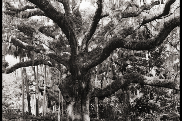
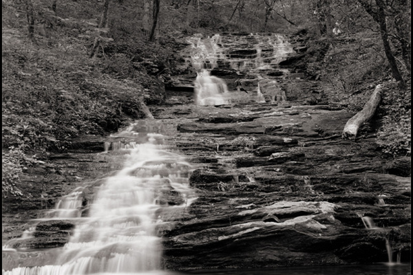
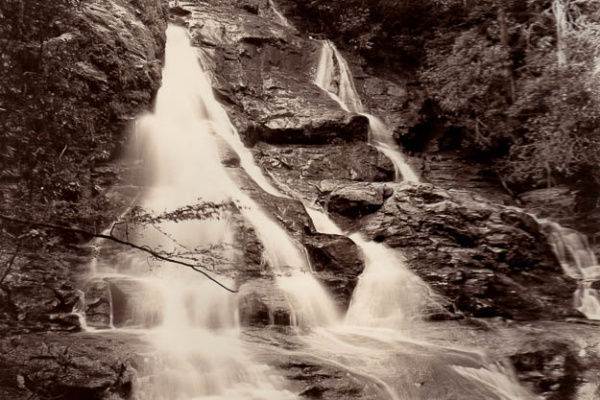
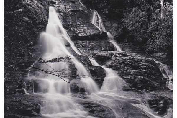
I dropped in the first print and within 1 minute the image was a lovely sepia tone. A nice lovely golden but yet still brown tone that is so much nicer than the chocolate of selenium. The shadows opened up and highlight detail just seemed brighter. Second sheet same result, Third sheet ditto. What amazed me about this was that the three sheets were different papers 1 MGFB Classic, one WarmTone, and one MGFB ART. The resulting color when dry is almost the same, noting tonal differences of the base paper and lack of gloss on Ilford Art.
Overall I am pleased with the Sepia tone and will experiment more. I may even like it better than the black and grey tones for waterfall images.
UPDATE: see Part II of this article here
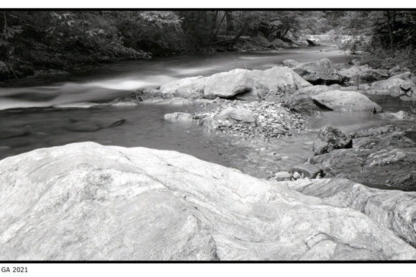
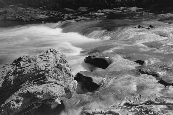
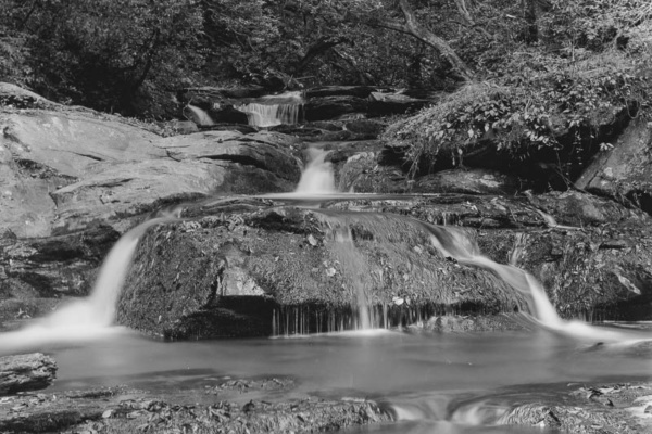
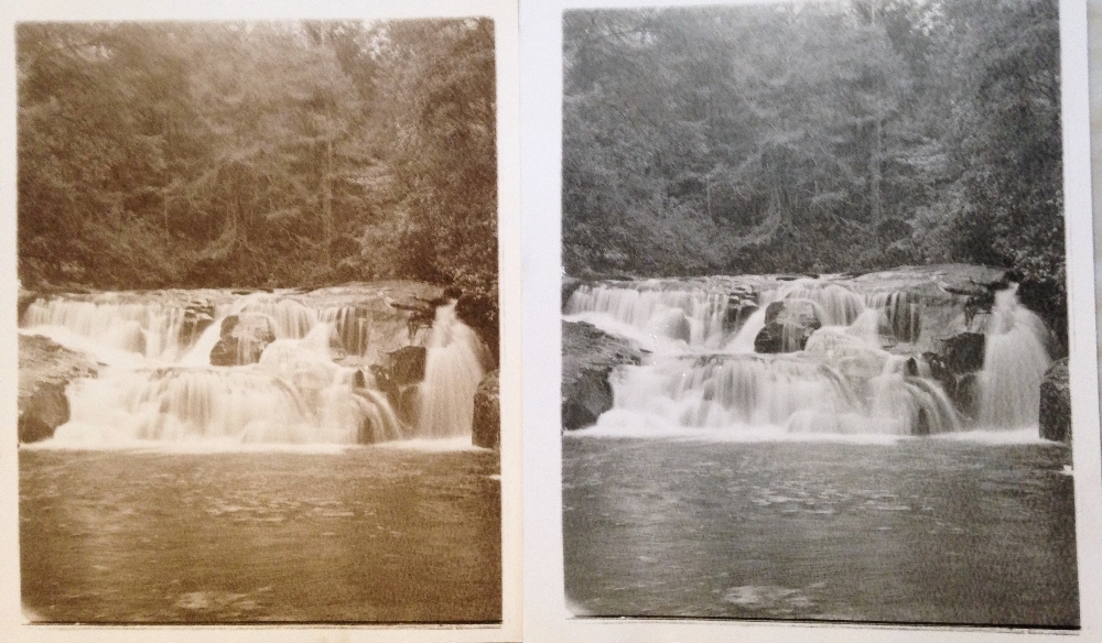
Ilford Art paper prints comparing Sepia Toned vs untoned, click for larger image.

 High Shoals Falls Print II
 North Georgia Large Format Photographers
Thanks for the post. I’m going to give this a try myself.