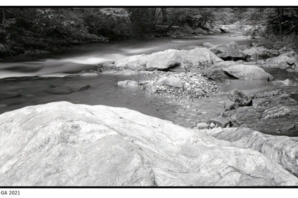
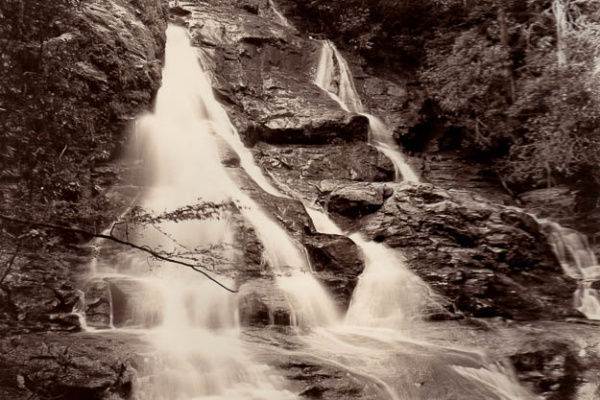
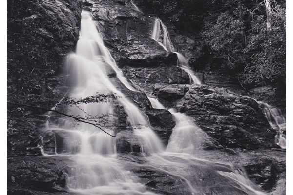
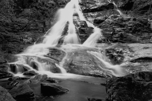
After printing the Cooper Creek image and being a little disappointed with the color and contrast I decided to re-print it using a warm tone paper. There are tons of images of warm tone paper prints having a deep rich brown color on the internet. What no one tells you is that is the result of using a dark brown toner, not the natural color of the paper. The natural color is just slightly warmer in darker tones and whites.
My first experience with the warmtone paper was that it took longer to expose and develop using my standard Ethol LPD at 1:2. Overall the shadows appeared softer but going overboard on the contrast grade was not helpful. Time was increased from 9 seconds to 16 seconds under the enlarger at Yellow 40 and Magenta 50 which was same as Ilford MGFB Classic for contrast settings. It also took the image about 45 seconds to first appear so I extended development time from 2 to 2.5 minutes. I assume when dry the warmtone paper will be less white on the borders. The difference in color is subtle between Classic and Warmtone. I did get more out of the dense bushes but it just looks lighter and not as “harsh”. So I did achieve what I was looking for except for the warm brown rich color. So my next darkroom experiment will be toning using selenium to see if I can alter the colors toward brown.

 North Georgia Large Format Photographers
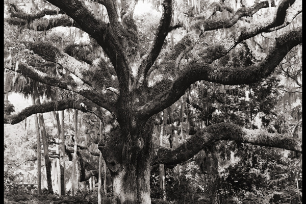
 Oak Tree Westview Cemetery Atlanta